UI Elements
Plug-ins compose their user interface from a small set of host elements.
show_quicksearch is the original fman API. The other elements live in
fman.ui, a provisional RoyiFileManager extension.
Rationale
The elements aim for a buttonless experience:
- Enter returns the result.
- Esc cancels.
| Element | Made for | Result |
|---|---|---|
| QuickSearch | Picking a single item from a fuzzy-searched text list | The chosen item |
| QuickList | Navigating, sorting and selecting multiple items in a fuzzy-searched text list | The chosen IDs; a handle drives the open list |
| QuickCheckList | Setting a state per item (checkbox, tri-state or star) over a fixed list | The changed states and the approval |
| QuickTable | Narrowing a predefined, immutable table with typed columns, per-column filters and fuzzy search | The remaining (visible) rows |
| QuickBoard | Composing one string with a caller-generated typed preview | The exact string and approval/cancellation |
| Panel | Operation controls and actions docked above the status bar | Values and actions delivered to callbacks |
| OutputTextBox | Showing selectable plain-text output that is easy to copy | Nothing; Enter copies the text |
- QuickSearch is the simplest and fastest list. It shows text items and closes with the item under the cursor.
- QuickList extends that to many items. The current item and the selected set are independent, and selections survive filtering.
- QuickCheckList looks like QuickSearch with a state indicator on the left. Enter and Shift+Enter approve with meanings the caller defines.
- QuickTable is for results with structure: names, paths, sizes and dates. The user narrows the rows down; the caller receives what remains. Ctrl+Enter is a Go To shortcut on a name or path cell.
- QuickBoard uses its text field to compose a string, not filter the table. The caller updates the preview; column filters only change its presentation.
- Panel holds the inputs of an operation (patterns, options, actions) so the result elements stay free of buttons.
- OutputTextBox shows a computed text, such as a hash, ready to copy.
New plug-ins should prefer the Qt-free services: show_quicksearch,
show_quick_list, show_quick_check_list, show_quick_table, show_quick_board
and show_panel. OutputTextBox is a Qt
widget hosted in a tool window.
QuickSearch
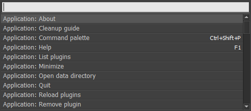
A fuzzy-searched text list for choosing one item. The call blocks until the dialog closes. Call it from a command.
show_quicksearch(get_items, get_tab_completion=None, query='', item=0)
QuicksearchItem(value, title=None, highlight=None, hint='', description='')
get_items(query)returns theQuicksearchItemrecords for the current query.get_tab_completion(query, item)optionally returns replacement query text for Tab.queryseeds the text box.itemselects the initial row.
For each QuicksearchItem, value is the payload and title defaults to
value. highlight lists the matched title character positions. hint and
description add secondary text.
from fman import DirectoryPaneCommand, QuicksearchItem, show_quicksearch
from fman.fs import iterdir
from fman.url import join


class PickChild(DirectoryPaneCommand):
    def __call__(self):
        folder = self.pane.get_path()
        names = tuple(iterdir(folder))

        def get_items(query):
            for name in names:
                if query.casefold() in name.casefold():
                    yield QuicksearchItem(join(folder, name), title=name)

        result = show_quicksearch(get_items)
        if result is not None and result[1] is not None:
            self.pane.place_cursor_at(result[1])
The example captures folder names before opening the dialog; its callback only
matches names in memory. get_items runs on the UI thread for every edit, so
keep it fast and free of I/O.
Enter or a click returns (query_text, selected_value). Escape returns None.
QuickList
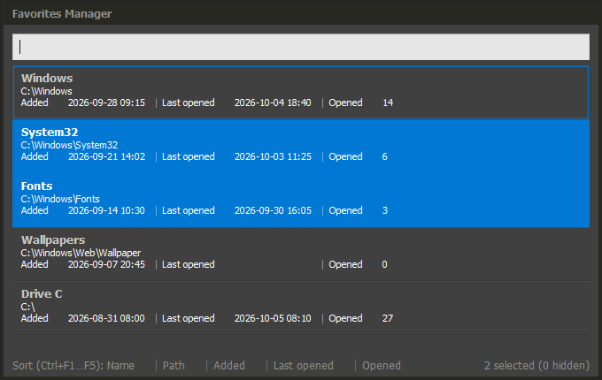
A fuzzy-searched text list for navigating, sorting and selecting multiple items. The current item and the selected set are independent, and selections survive filtering. A handle can drive the list while it is open.
show_quick_list(*, items, title='', summary='', modal=True, filter='fuzzy', query='',
    selected=(), title_label=None, hint_label=None, sort=None, settings=None,
    on_open=None) -> tuple | None
ListItem(id, title, hint='', metadata={})
items:ListItemrecords with unique string IDs.title,summary: the window header and optional secondary text.modal:Trueblocks the main window;Falsekeeps it usable.filter:'fuzzy'(default) orNoneto hide the filter box.query: the initial filter text.selected: IDs to preselect.title_label/hint_labelmake the title / hint sortable under that label.sort=(label, ascending): the initial order. Metadata labels are always sortable.settings='Name.json': saves the user's sort (keyssort,ascending) and overridessortnext time.on_open(handle): runs once before the window appears, supplying aQuickListHandleto drive the open list.
ListItem is a frozen record. IDs and titles hold up to 512 characters;
hint is the second line, up to 2048 characters. metadata maps up to 8 labels
to values shown on a third line: a string, an int or finite float,
(sort_key, text), or () for empty. Every item lists the same labels in the
same order; an item without a value still lists the label, with (). Labels
are up to 32 characters; texts up to 128.
from fman import DirectoryPaneCommand, show_status_message
from fman.ui import Action, ListItem, UiController, show_panel, show_quick_list


class ColorsUI(UiController):
    pass


class ShowColors(DirectoryPaneCommand):
    def __call__(self):
        owner = ColorsUI.require_owner()
        items = (ListItem('red', 'Red', metadata={'Wave': 700}),
            ListItem('green', 'Green', metadata={'Wave': 530}))

        handles = []

        def on_open(handle):
            handles.append(handle)
            owner.attach(handle.close)
            show_panel(owner=owner, pane=self.pane, rows=((Action('count', 'Count'),),),
                on_action=lambda name, values: show_status_message(
                    '%d chosen' % len(handle.snapshot().chosen)),
                on_closed=handle.close)

        try:
            result = show_quick_list(items=items, title='Colors', modal=False,
                title_label='Name', on_open=on_open)
        finally:
            for handle in handles:
                owner.detach(handle.close)
        if result:
            show_status_message(', '.join(result))
The example pairs a modeless list with show_panel, as the Favorites Manager
does. A driver ties the list to its plug-in by owner.attach(handle.close) and
detaches in a finally.
Enter returns the chosen IDs: the selection, or the current item when nothing
is selected. Escape returns None. The call blocks: on a worker it waits; on
the Qt thread it runs a nested loop.
The window is frameless, like QuickSearch. A nonempty title is shown as a
header; dragging it moves the window. Metadata fields are aligned in columns
separated by │.
| Key | Action |
|---|---|
| Space, Ins, Shift + navigation, Ctrl+A | Select in the list |
| Ctrl+I / Ctrl+Shift+A | Invert / clear the selection |
| Ctrl+F1 … Ctrl+F10 | Sort by the n-th field: ascending, descending, then the original order. The footer lists the keys and marks the current sort |
| Tab | Moves to the docked Panel of a modeless list and back |
| Enter / Esc | Accept / cancel |
The QuickListHandle drives the open list from any thread:
| Member | Effect |
|---|---|
snapshot() |
QuickListState(selected, chosen, current, query, sort) |
set_items(items) |
Replaces the items; returns once applied. Removed selections are dropped. |
focus() |
Raises the list. |
close(result=None) |
Closes it; result is None or a tuple of current IDs. |
is_open |
False after close. |
QuickCheckList
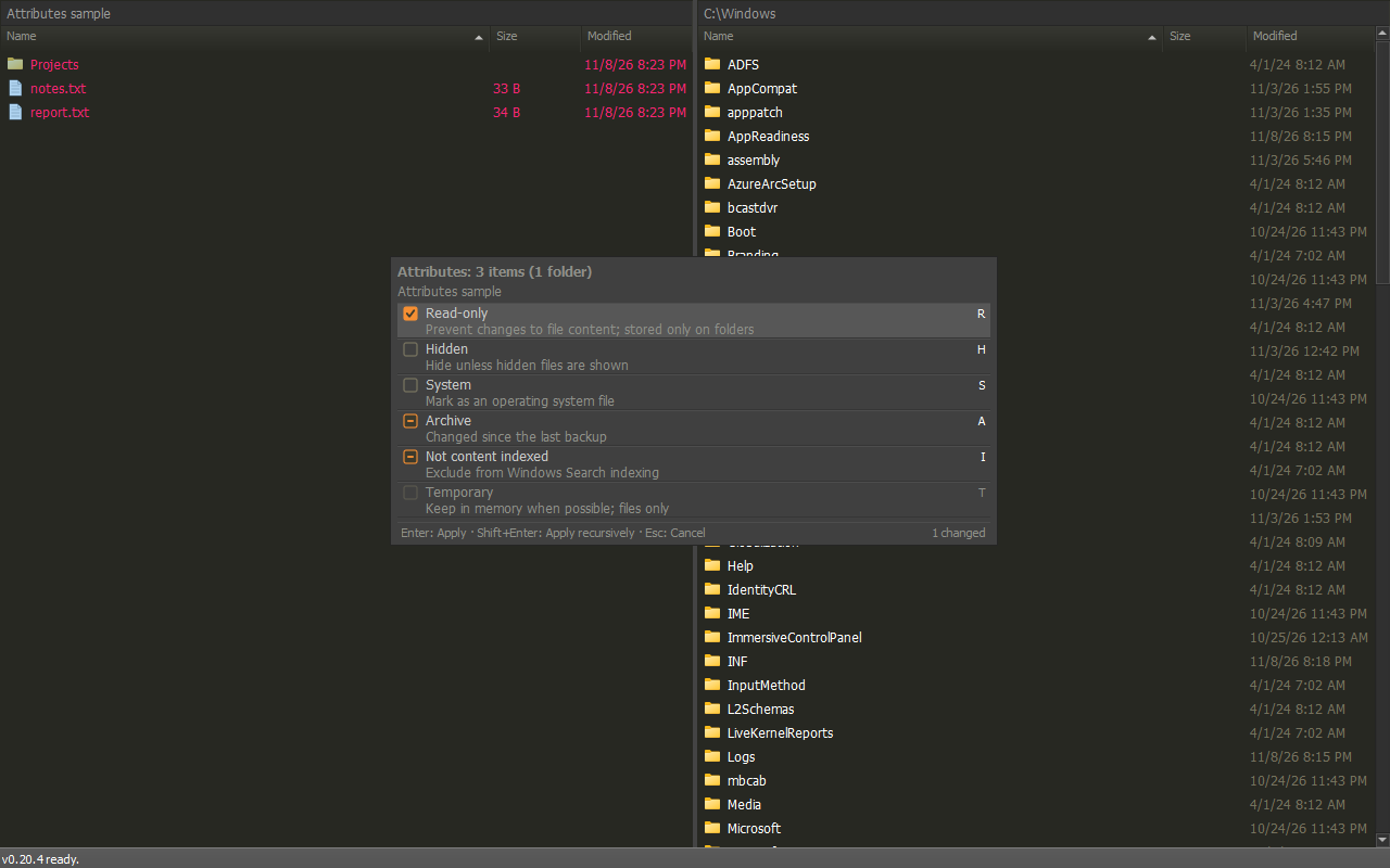
checkbox3 preset.A modal, frameless list for setting a state per item, such as file attributes. Rows look like QuickSearch rows with a state indicator on the left. The list is fixed while the window is open.
show_quick_check_list(*, items, states='checkbox', title='', summary='', status='',
    filter=None, alternate=False) -> CheckListResult
CheckListItem(id, title, state, hint='', description='', enabled=True)
CheckListResult(changed, approval)
items: 1-1,000CheckListItemrecords with unique IDs.stateis the starting state. Disabled items are dimmed and never change.states: a preset.
| Preset | States | Look |
|---|---|---|
checkbox |
off, on |
Olive outline / orange box with a check |
checkbox3 |
off, on, mixed (start-only) |
As checkbox; mixed is a brown box |
star |
empty, filled |
Olive outline / orange star |
mixed is reachable only on items that started mixed.
- title, summary: the draggable header and an optional secondary line.
Both, like status, show as one elided line with the full text in a tooltip.
- status: caller text on the left of the bottom status bar, typically the key
labels. The right side counts the changed items.
- filter: 'fuzzy' shows a filter box; None (default) hides it.
- alternate: whether Shift+Enter approves.
from fman import DirectoryPaneCommand, show_status_message
from fman.ui import CheckListItem, show_quick_check_list


class PickFlags(DirectoryPaneCommand):
    def __call__(self):
        changed, approval = show_quick_check_list(
            items=(CheckListItem('hidden', 'Hidden', 'mixed', 'H'),
                CheckListItem('readonly', 'Read-only', 'off', 'R')),
            states='checkbox3', title='Flags',
            status='Enter: Apply · Shift+Enter: Apply recursively', alternate=True)
        if approval is not None and changed:
            show_status_message('%s: %r' % (approval, changed))
changed maps item IDs to final states, for changed items only. approval is
'primary' (Enter), 'alternate' (Shift+Enter) or None (Esc,
window or main-window close); a cancelled result still carries the changes.
The caller defines what each approval means. The call blocks: on a worker it
waits; on the Qt thread it runs a nested loop.
| Key | Action |
|---|---|
| Space / click on the indicator | Next state |
| Shift+Space | Previous state |
| Ins | Next state, then move down |
| Up / Down in the filter | Move into the list |
| Enter / Shift+Enter | Primary / alternate approval |
| Esc | Cancel |
The indicator colors come from the .quickchecklist-state,
.quickchecklist-state-active and .quickchecklist-state-mark theme selectors.
QuickBoard
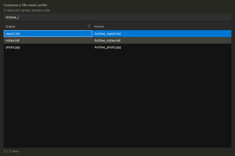
title is the draggable header, text initializes the composition field, and summary provides the line above it.A modal, frameless, buttonless string-composition dialog with the same table, columns, theme and filter menus as QuickTable. The caller owns the preview and any expression grammar; the text field composes a string rather than filtering the table.
columns: fixedQuickTableColumndescriptors, using the same kinds and options as QuickTable.get_rows(text, mapping): must return the two-item tuple(rows, caller_status), where rows is an iterable ofQuickTableRowand status is a string orNone. Rows and source order stay fixed per dialog; generated columns must disable sorting and filtering. Use(rows, None)to leave the right side of the footer empty. Rows-only returns are rejected; changereturn rowstoreturn rows, Nonein earlier callbacks.text: the initial string, returned without trimming.title: the draggable window header.summary: optional plain secondary text above the composition field; its meaning belongs to the caller.
from fman.ui import QuickTableColumn, QuickTableRow, show_quick_board


def compose_prefix():
    names = ('report.txt', 'notes.md', 'photo.jpg')

    def get_rows(prefix, mapping):
      return tuple(QuickTableRow((name, prefix + name)) for name in names), None

    return show_quick_board(
        columns=(QuickTableColumn('Original'),
          QuickTableColumn('Preview', sortable=False, filterable=False)),
        get_rows=get_rows,
        text='Archive_',
        title='Compose a file-name prefix',
        summary='3 captured names; preview only',
    )
The screenshot uses this public-API-only example. Call compose_prefix();
no owner or controller subclass is needed. The result is the composed prefix
its approval flag and source-to-view map; the example renames no files. The caller decides what
to do with an accepted string.
- Enter returns
(text, True, mapping)after the matching preview settles. During work it queues approval; another text/view edit or error clears it. - Esc or window close returns
(text, False, None), preserving the draft and spaces. - Sorting and column filters survive preview replacement and update the map. Clear All Filters leaves the composed string untouched. Empty previews are valid.
- Ctrl+F focuses/selects the composition field. Up/Down/Page Up/Page Down focus the table; Tab/Shift+Tab move between them. Alt+Down opens the current column filter, whose Enter/Escape keys remain local to the menu.
- Copy uses displayed cell text. There is no Go To, pane, mutable public handle, row result, or operation button.
- A text edit or arriving preview closes an open column filter editor, discarding its unapplied draft; committed filters remain active.
Preview and limits
- Updates after 100 ms of typing inactivity. Enter skips the delay; sorting and filtering update immediately.
- Callbacks run off Qt: keep them bounded and read-only. Closing cancels pending work.
- Preview errors block acceptance.
ValueErrorappears inline; other exceptions also show an alert. Retained rows are markedStale preview. - Optional right-side status: up to 512 characters;
Nonehides it. Status is informational, not validation. - Limits: 25,000 rows, 16 columns, 16 MiB preview; single-line input up to 4,096 UTF-16 units.
Full contract: plug-in API reference.
Row Mapping
The immutable tuple maps each generator row to its zero-based visible position,
or None if hidden. Generated [A, B, C, D] displayed as [C, A] produces
(1, None, 0, None). The first callback receives mapping=None; projection then
supplies the map. Later text edits reuse it. Sorting/filtering changes regenerate
the preview. Responses keep generator order and all rows, including hidden ones.
Sortable/filterable source cells must remain fixed for the whole dialog;
view-dependent fields use sortable=False, filterable=False.
Enter returns the exact settled text, mapping and preview revision. Later text
or view edits clear queued acceptance. Cancellation preserves the draft and
returns (text, False, None). Hidden-row entries are distinct from an absent
mapping; an all-hidden snapshot has a tuple of None entries.
The UI does not decide operation scope or validate filenames. A renamer can use non-None rows as its targets, while checking their names against all occupied folder entries, including hidden and unselected files. These remain caller rules. The full preview must fit the limits; errors block approval instead of silently truncating rows. QuickTable retains its own 10,000-row/64-column limits. See the API details.
QuickTable
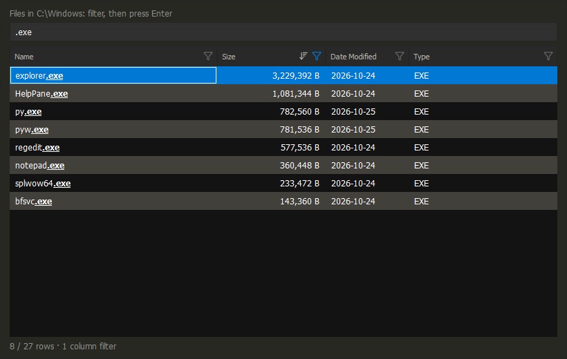
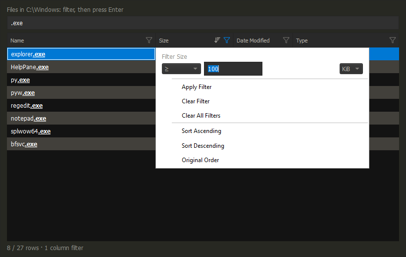
An immutable table for narrowing predefined rows with typed columns, per-column
filters and fuzzy search. The table is a static snapshot. The call blocks until
the window closes and returns the positions in rows of the visible rows, in
input order.
show_quick_table(*, columns, rows, pane=None, title='', summary='', modal=True,
    text_filter='fuzzy', base_path=None, truncated=None) -> tuple[int, ...] | None

QuickTableColumn(label, kind='text', sortable=True, filterable=True, searchable=None,
    unit=None, date_display='timestamp', format=None, missing='Unknown')
QuickTableRow(cells, highlights=(), targets=())
columns: 1-64QuickTableColumndescriptors.rows: up to 10,000QuickTableRowrecords, one cell per column.pane: enables Go To and resolves relative paths against its folder.title,summary: window title and one line above the table. Use them to tell the user what Enter does.modal:Trueblocks the main window and closes after Go To.Falsekeeps the main window usable and the table open.text_filter:'fuzzy'(default),'substring',None(no filter box) orcompile(query) -> predicate(cells)for caller matching.base_path: folder for relative paths, instead of the pane's folder.truncated:Trueadds· truncatedto the row count when the producer omitted rows.
QuickTableColumn supplies the column label and its capabilities:
sortable / filterable enable sorting and filtering. The kind determines
the cell type, filter and sort:
| Kind | Cell | Filter | Sort |
|---|---|---|---|
text |
str |
Fuzzy / Contains | Case-insensitive |
file_name, folder_name |
str |
Fuzzy / Contains | Natural |
file_path, folder_path, entry_path |
str |
Fuzzy / Contains | Natural |
date |
UTC epoch nanoseconds or None |
On, Before, After, Between, Missing | Chronological |
numeric |
int, float or None |
=, <, <=, >, >=, Between, Missing |
Numeric |
unit='bytes'formats sizes and adds a B/KiB/MiB/GiB filter unit.date_display='date'showsYYYY-MM-DD; the default adds the time.format(value) -> stroverrides numeric display.missingis the text forNone.searchableselects the columns the text query matches; default: text-like columns.
QuickTableRow holds the values and optional display/navigation data:
cells: one value per column, typed as above.highlights: optional(start, end)character spans per column.targets: optional absolute path per name/path column. Copy and Go To use it instead of the cell text, so the displayed text can be shortened.
import os

from fman import DirectoryPaneCommand
from fman.ui import QuickTableColumn, QuickTableRow, show_quick_table
from fman.url import as_human_readable, as_url

COLUMNS = (
    QuickTableColumn('Name', 'file_name'),
    QuickTableColumn('Size', 'numeric', unit='bytes'),
    QuickTableColumn('Date Modified', 'date', date_display='date'),
)


class SelectFilesByTable(DirectoryPaneCommand):
    def __call__(self):
        folder = as_human_readable(self.pane.get_path())
        with os.scandir(folder) as entries:
            files = [entry for entry in entries if entry.is_file()]
        rows = [QuickTableRow((entry.name, entry.stat().st_size, entry.stat().st_mtime_ns))
            for entry in files]
        kept = show_quick_table(columns=COLUMNS, rows=rows, pane=self.pane, title='Select Files',
            summary='Narrow the files, then press Enter to select them')
        if kept is not None:
            self.pane.clear_selection()
            for index in kept:
                self.pane.toggle_selection(as_url(files[index].path))
The example captures files from the pane's folder, lets the user narrow them, then selects the returned positions in the pane. Name and path kinds add Copy and Go To to the cell menu.
A row is visible when it matches the text query and every column filter. Search Files and Find Files show their results in a QuickTable; see the results table from the user's side.
| Key | Effect |
|---|---|
| Enter | Close and return the visible rows |
| Esc | Close and return None |
| Ctrl+Enter, double-click | Go To the file or folder of the current name/path cell |
| Alt+Down | Filter menu of the current column |
| Ctrl+F | Focus the filter box |
| Header click | Sort ascending, descending, then original order |
Panel

A Panel docks across the main window above the status bar. It holds operation controls and actions, delivering values to callbacks rather than returning a selection.
owner: the loader-owned lifetime of aUiControllersubclass in the plug-in package, obtained withMyUI.require_owner().pane: the public directory pane whose main window hosts the Panel.rows: a tuple of rows, each a tuple of frozen descriptors (up to 16 by 16).on_change(values): optional callback for every edit.on_action(action_id, values): optional callback for an action.on_closed: optional session-closure callback.
Use these descriptors in rows:
| Descriptor | Control |
|---|---|
TextField(id, label, value='', tooltip='', max_width=None) |
Text input |
Toggle(id, icon, label, value=False, tooltip='') |
Checkable icon button |
Choice(id, label, options, value, tooltip='') |
2-8 mutually exclusive icon buttons |
Select(id, label, options, value, tooltip='') |
Dropdown of (value, label) pairs |
DateField(id, label, value=None, tooltip='') |
Optional ISO date picker |
IntegerField(id, label, value=None, minimum=0, maximum=..., tooltip='') |
Optional integer stepper |
Label(id, text, icon=None, tooltip='') |
Text with an optional icon |
Action(id, label, icon=None, tooltip='') |
Button that calls on_action |
Separator(id) |
Vertical divider |
from fman import DirectoryPaneCommand, show_status_message
from fman.ui import Action, TextField, UiController, show_panel


class GreetUI(UiController):
    pass


class ShowGreeter(DirectoryPaneCommand):
    def __call__(self):
        def on_action(action_id, values):
            if action_id == 'greet':
                show_status_message('Hello, ' + (values['name'] or 'World'))

        show_panel(owner=GreetUI.require_owner(), pane=self.pane,
            rows=((TextField('name', 'Name'), Action('greet', 'Greet')),),
            on_action=on_action)
The example uses a text input and a Greet action; the callback reads the
current name value and shows a status message.
Icons are SVG files relative to the plug-in folder. on_change and on_action
run on the Qt thread: start long work on a worker.
The returned PanelHandle provides snapshot(),
update(values=None, enabled=None), set_activity_status(text), close(),
is_open and cancelled.
One Panel docks per main window; showing another replaces it. Escape or the close icon ends the session.
OutputTextBox
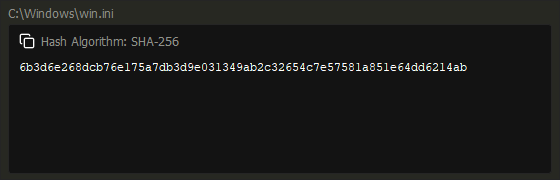
A read-only Qt widget for selectable plain-text output, such as a hash or folder
path, with a copy icon. Build it in UiController.build on the Qt thread.
text: the initial complete plain text. HTML is shown literally.parent: the parent Qt widget, normally the host tool window.title: the header beside the copy icon; it is never copied.
from fman import DirectoryPaneCommand
from fman.ui import OutputTextBox, UiController
from fman.url import as_human_readable
from PyQt5.QtWidgets import QVBoxLayout


class PathUI(UiController):
    @classmethod
    def build(cls, window, pane):
        output = OutputTextBox(as_human_readable(pane.get_path()), window, title='Folder')
        window.focus_widget = output
        QVBoxLayout(window).addWidget(output)


class ShowFolderPath(DirectoryPaneCommand):
    def __call__(self):
        PathUI.show(self.pane)
The example shows the pane's folder path in an owner-managed tool window and gives the output focus so Enter copies it.
set_text(text)/text(): replace or read the complete plain text.set_title(title)/title(): replace or read the header.copy_text()copies the complete text. Enter and the copy icon do the same.copied: signal emitted after each copy, for caller feedback.
Reference
The full plug-in API reference covers every element contract, threading rule and lifetime detail.